Chapter 3: The Lighthouse
Mira climbed the last step. Below her, the sea was quiet. She opened the small wooden door, and light poured in.
IncluRead · Brand strategy & identity
For some children, reading is not difficult because they lack ability. It is difficult because traditional reading experiences are not designed around the way they read.
Empathy map: Children
“I'm not slow, reading just takes me longer.” “Will this make me feel different again?”

DyslexiaBuddy
Reading coach for kids with dyslexia; customisable fonts, colours, spacing.
What works
What feels off
Friendly and memorable, busy, less suitable for adult audience.
The gap (hypothesis)
A brand for teens and adults too, that looks like a good normal reading app and treats accessibility as a feature, not a label.
I also checked
Read&Write, Helperbird, Dyslexia Reader by MDA, Lexy, Fluency.
Adjacent brands the client admires
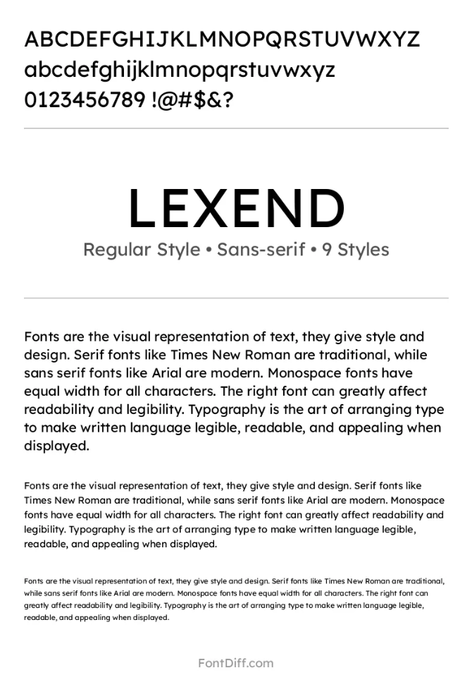
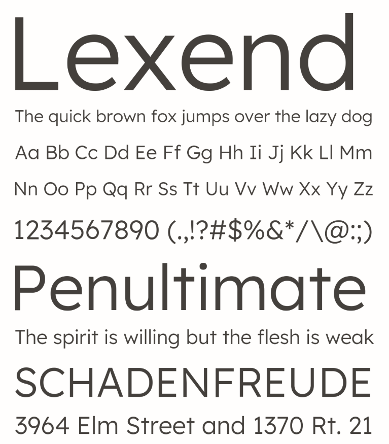
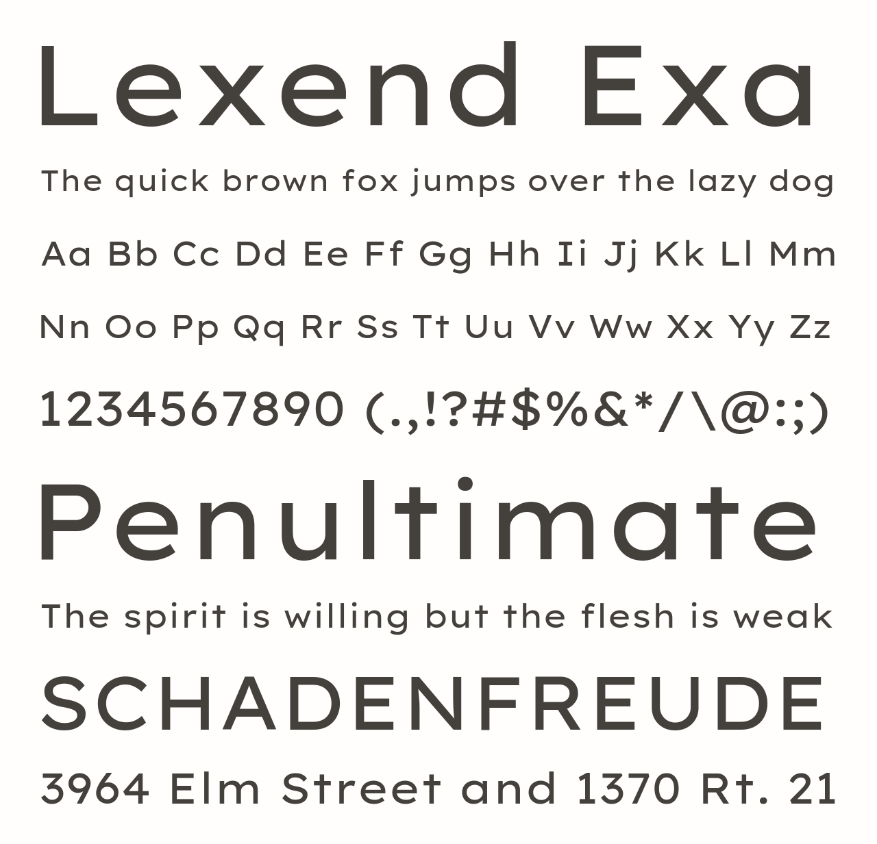
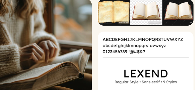
Headspace / Calm (calm, friendly), Duolingo (encouraging), Be My Eyes (warm, dignified), Kobo / Libby / Storytel (reading brands), Lexend (readability as design).
Common patterns
Bright primary colours, cartoon mascots, book or brain icons, a “for kids” tone. The other extreme: plain, generic-blue tool look.
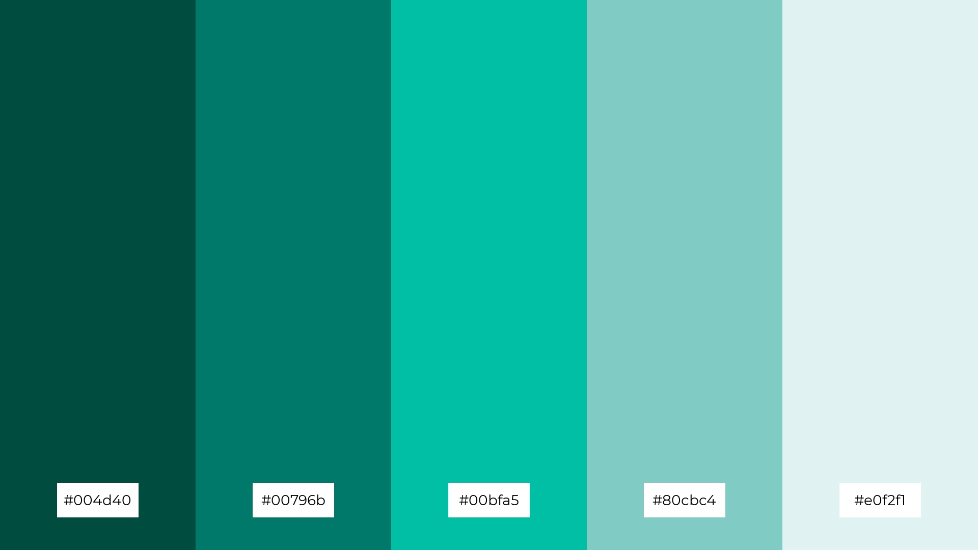
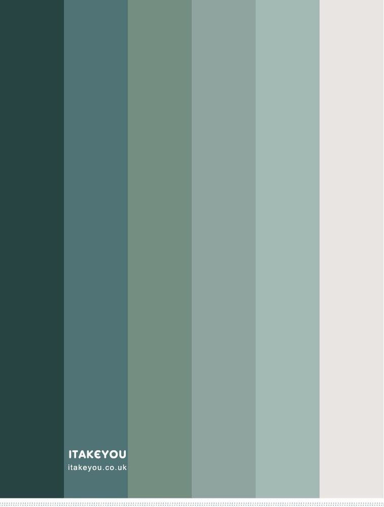
Soft blue
#6694BF
Teal
#1CAAB7
Deep blue
#2F5F8F
Mist
#DCEBF3
Paper
Warm off-white
Ink
Body text




Playful, but not too child-focused.
Friendly, but still credible. “Not a hospital.”
Grown-up enough for teens and adults, a real book, not a baby book.
Calm and clear, with a confident symbol.
Empowering, rather than defining someone by their difficulty.
Tap or hover a marker. Three words for the brand: Accessible · Empowering · Supportive
The old narrative
Switch between the two to see the shift the brand is built on.
Everything starts with one change of belief: the reader was never the thing that needed fixing.
Once the page adapts, reading stops being a test of ability and becomes an experience that can be chosen freely.
The brand idea
Every reader, on their own terms.
IncluRead gives readers access without labels, support without stigma, and quiet confidence in a space that treats them as capable.
This belief guides every decision that follows: the voice, the colour, the typography and the mark itself.
Openness, nothing closed or gated.
Avoided entirely: scrambled letters, brains, medical imagery.
“Good identity design is a visual translation of the brand idea.”
Test the system
Mira climbed the last step. Below her, the sea was quiet. She opened the small wooden door, and light poured in.
What the logo must pass
The symbol must read clearly at 16×16 px (favicon) and 32×32 px. No detail thinner than 1 px at 16 px. Also tested at 8 mm wide in print.
Versions in full colour, black and white. Tested on soft blue #6694BF, teal #1CAAB7, white and black. Clear space equals the height of the letter "I". Minimum width: 80 px digital, 20 mm print.
Reading should feel easier.
How the product behaves becomes the rules for the logo and the visual identity.
→ What it means for the identity
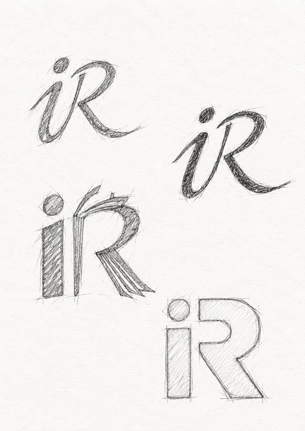
The logo is drawn for the reader with the most visual stress first: open, simple letterforms, a clear i and R, and no mirrored shapes that could be read as b or d.
→ In practice
If the mark is readable at 16 px for a child with dyslexia, it works for everyone, everywhere.
I started with a simple question:
How can we make reading feel more accessible without making children feel different?
The answer will shape not only the logo, but the entire experience.